
Here we explain how and why the MHQ scale is constructed including addressing common questions such as why the MHQ uses a negative-positive scale as shown below and why it has a bimodal distribution across the population.
The goal of the MHQ
The end goal in the construction of the MHQ was to have a score where a ten-point shift on the scale from any place in any direction has similar functional meaning. By functional meaning we refer to the ability to carry out your daily work or tasks.
So first, let’s look at the end result. This graph (Figure 1) shows two measures – 1) the average number of days a person missed work in the month prior to taking the MHQ against the MHQ score shown in blue (employed people only) and 2) the average number of days in the month prior to the assessment where the person missed work or could not get their work or daily tasks done even if they went to work shown in red. As you can see, the latter is basically a straight line which means that your ability to function in terms of your productive time changes about the same wherever you start and move on the scale. For days worked the relationship is different suggesting that people often still go to work but simply aren’t able to get things done.
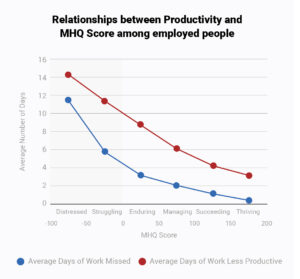
Figure 1: Relationship between MHQ score and function
So how do we get here?
Scores that simply average answer ratings cannot accomplish this
Most assessments that have scored answers on a rating scale simply add up the scores across the questions and report an average. A major problem with this is that someone who is middle of the road on all rated elements will have the same score as someone who has some very severe problems in some areas and no problems in others. Another problem is that one person with just a few severe problems will have a lesser score than a person with a larger number of severe problems although both may be equally incapacitated functionally. To understand why this is problematic consider the analogy to physical illness. If we were to average up rating scores on all physical problems, someone whose only symptom was severe breathing difficulty would score lower than someone who had multiple moderate symptoms of fever, cough, cold, body ache and so on. However, the person with breathing difficulty is probably worse off functionally and has a much higher probability of dying than the second person. The same holds for mental health. Functional capability is not really about the number of symptoms. Rather it is about which symptoms you have and how severe they are.
Now you might think that you can fix this by weighting each rated element differently. However this doesn’t solve the problem if there are a number of symptoms that meet a high threshold of functional importance. The challenge is therefore, how do you pick out people with a few significant challenges and distinguish the more serious challenges from the less serious challenges?
So now that you know what we are solving for we will walk you through the logic of the MHQ score algorithm below.
Step 1: Categorizing symptoms by severity and negative-positive thresholding
Remember that the MHQ assesses 47 mental elements on a life impact scale that span symptoms of ten major mental health disorders as defined by the DSM as well as positive aspects of mental function. We use two 1-9 rating scales (Figure 2), one for mental elements that can have both positive and negative impact (spectrum scale above) and one for mental aspects that are purely problematic that is a unidimensional scale of severity of impact. (problem scale below)
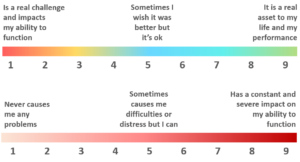
Figure 2 : Rating scales for spectrum items (above; e.g. self-worth & confidence) and problem
items (e.g. suicidal thoughts & intentions)
First, we reverse the problem scale so that a lower number is worst to align it with the direction of the spectrum scale. All mental elements are then stratified into three groups of seriousness. This translates to three different thresholds on the rating scales for what to consider ‘negative’.
Across the 47 elements we categorize them by three levels of functional severity based on their potential consequences. Of courses, this starts with a best judgement of which elements to categorize in which tier which can then be optimized. For each of these three levels we set a different rating threshold at which we would consider the person in a negative realm of functioning. Essentially, the idea is that this negative threshold distinguishes those who are distressed or struggling at a level that requires intervention to help them function better versus those who are simply managing normal ups and downs of life.
Suicidal thoughts for instance would be in a severe bucket and on a 1-9 rating would have a lower threshold of say >4 to be called out as being in a ‘negative’ category. On the other hand, you would have to have a much more severe rating on something like Restlessness to be considered in the negative range. We then shift the scale such that instead of 1-9 it becomes a negative-positive scale where 0 is the threshold between negative and positive. An illustrative example for three tiers of problems is shown below in Figure 3.

Figure 3: Shifted scale for three tiers of increasing seriousness of problems
Why have negative numbers you might ask? Why not just have positive numbers? We use the negative-positive distinction as a way of picking out those who would be considered in a negative realm of functioning and need help or intervention. It’s not strictly necessary to shift this way though. This is more for the way we want to communicate it.
Step 2: Nonlinear amplification of the scale
We next apply a nonlinear transformation to the scale that amplifies scores that are towards the negative end.
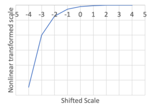
Figure 4: Nonlinear transformation of the scale makes negative values more negative
This means that each rating point you move towards the end of the negative scale the more negative it becomes in the transformed score. Essentially it stretches out the negative side of the scores compared to the positive side Now once this transformation is done, the scores are added up and if you have even a few really high serious negative elements this can bump you into a negative score even if you are doing fine on everything else. The transformed distribution then goes from the normal distribution you get if you just sum all the scores to a long tailed distribution (Figure 5).
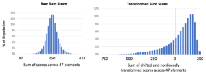
Figure 5: Distribution of raw sum scores across the population compared to distribution of transformed sum scores (after shifting and nonlinearly transforming the scale)
Step 3: Normalizing the scale
Now we have artificially created this long tail in order to ensure that we pick out all those people who are struggling seriously enough with one or more things. It’s not that people are actually 3 or 4 times mentally sicker on the left end. (Think of it like this: How sick you are is not about how many diseases or symptoms you have. If you have cancer you are sick, if you have heart failure you are sick, If you have any one serious disease you are still sick, someone with terminal cancer and heart failure is not really functionally sicker than someone with terminal cancer). Besides, it’s not useful to scare people with really low numbers. How do we bring this back to functional range?
We accomplish this by differently normalizing the negative and positive sides of the distribution so that the positive side of the scale ranges from 0 to 200 and the negative side ranges from -1 to -100. Essentially, we are squashing back the long negative tail of the distribution to the left of the 0 line in the transformed distribution above so that 99% are between -1 and -100. It makes the distribution looks like this. Those that are in that last 1% just get forced to -100 so in our global data the last bar will be a bit higher. We use the 99% value to normalize because if we normalize it by that last 1% that stretches out really far, it squashes most of the data into too few bins.
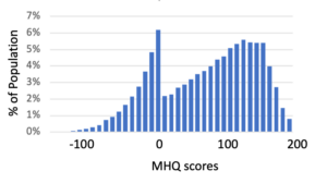
Figure 6: MHQ scores obtained after normalizing the negative and positive sides of the transformed sum scores
We note that this scoring was calibrated on a dataset obtained in 2019 from the English-speaking population from USA, UK and India such that the numerical population mean (not the modes) was 100. This then forms a reference point going forward. The negative peak has gotten bigger since the pandemic with global numerical averages now at 66. You can look at Figure 1 to see what that means in functional terms.
The distribution is odd looking to be sure, but a smooth distribution is not the point. What we want is functional equivalence of shifts along the scale – which we have accomplished. In addition, 89% of those who do have negative scores map to at least one disorder as defined by the DSM (compared to <1% in the positive range), and in general those with negative scores have about 5 or more ‘symptoms’. So in this sense the negative-positive separation also has a clinical relevance.