Inter and intra person variability in brain metrics across the population can result in misleading interpretation of results. It is important to understand the distributions of these metrics in the population.
Across the scientific literature the most common way of representing data is to compare a particular metric in two samples as a bar graph showing the means of each group with an error bar that is either the standard deviation or standard error of the mean and calculating a p-value using a standard students t-test. The paper would then likely have text stating that ‘There was significantly higher [ METRIC OF INTEREST] in people in [GROUP1] relative to [GROUP2] (p<0.05)’.
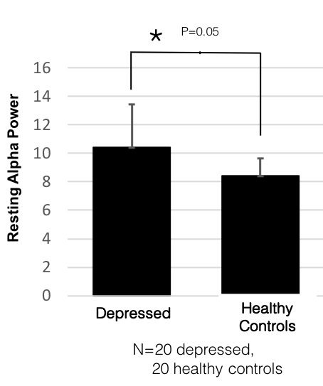
For the purpose of illustration, let’s use a more concrete example as follows (with the caveat that this is not meant to describe an actual result but just put it in more specific words to make it easier to read):
There was significantly higher resting alpha band power in people with depression relative to healthy controls (p<0.05).
Picking up on this the media might have a headline:
Researchers find a key difference between depressed and normal brains!!!!!
A study showed that people with depression have higher alpha band power relative to healthy controls…
What is the problem with this?
There are multiple issues with this interpretation. First, the distributions of both groups probably overlap a lot so many people in the control group may actually have higher values of the metric relative to many in the depressed group. Small population shifts cannot be interpreted at the individual level – this is a major issue unto itself. However, here will discuss a different issue, which is that, depending on the variability of the particular metric in the population, the result and its interpretation may be completely wrong – even at the population level.
The primary reason is that this interpretation assumes that the metric of interest is normally distributed in the population. This is a dangerous assumption. No studies yet provide a sufficient view into the global distribution of various brain metrics. With an adult population of some 5 Billion people and an average study sample size of 40 subjects who are usually not representative of global demographics, this represents sampling of just ~ 0.0000008 % or less than 1 out of every 10 million people. Furthermore, typically these samples are biased geographically and demographically.
Here are some examples that illustrate how different underlying distributions can invalidate population level conclusions arrived at as above.
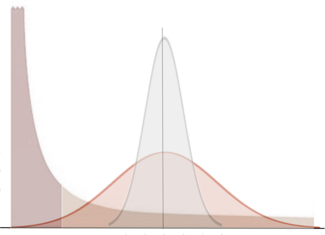
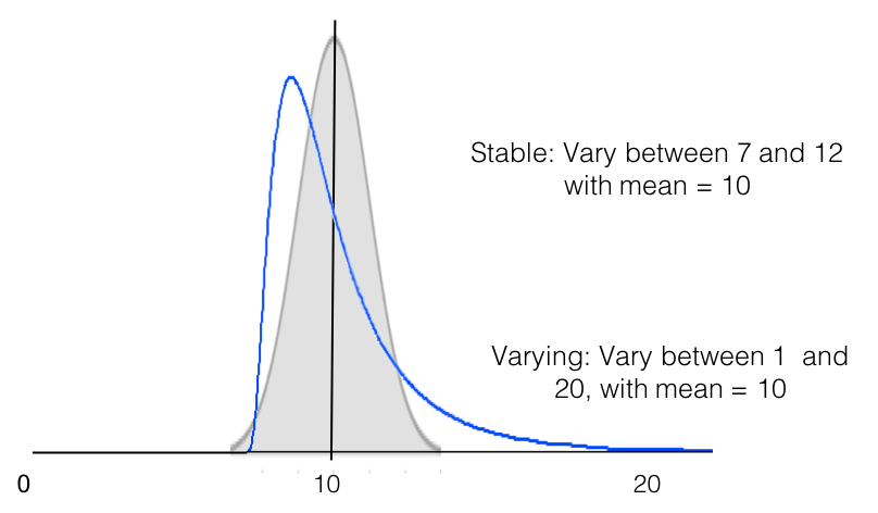
A skewed distribution
Imagine a situation where you are comparing two groups. If the metric of interest varies across individuals according to the same long tailed distribution for both groups such as either one of the distributions in the example below, it is easy to find significance where there is none.
 Comparing two sets of 20 samples from such a distribution will give you a t-test of <0.05 some fraction of the time such as in this example below even though the underlying distribution is common.
 If you keep repeating this experiment, drawing a different 20 people each time, while most of the time you will draw from the left of the distribution giving you the impression that you have a roughly normal distribution, you will choose a varying assortment of people at further points in the tail with decreasing probability. Sometimes you will get someone on the far end of the tail who will change the mean and standard deviation substantially. This is not an unexplained ‘outlier’ to be discarded but rather a hint of a large sampling error. In fact, depending on how long you make your tail if you repeat the sampling hundreds of times and compare the samples by t-test, you can end up with a significant result (in either direction) even upwards of 20% of the time if you have certain kinds of sampling biases in your design (e.g. for the population distribution reflects some underlying third demographic criteria which was overlooked and you consistently drew controls from one group such as University Students but the other group from the hospital across town). This could easily account for some of the variability and lack of reproducibility in results that plagues the field.
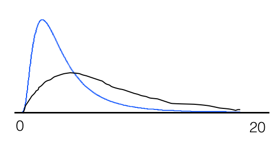
Changing distributions with the same mean
Another situation that can arise is that the distribution changes while the mean stays the same. In this case you will find no significant difference even though there is a substantial and significant change. Imagine a situation where you are comparing two groups from the population. Both have normal distributions but in one group the metric is more stable while in the other it varies more such as in the example below.
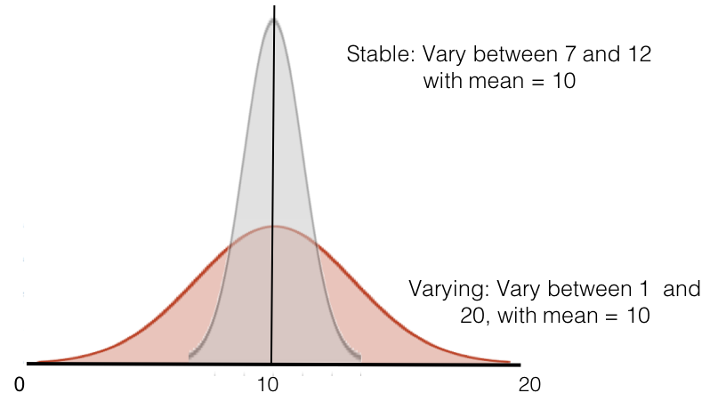 For instance, maybe group 1 are normal controls while group 2 are bipolar where the metric fluctuates within individuals more frequently. In this case you will likely sample different people at different points in their trajectory for bipolar resulting in broader distribution of the same metric. In this case you will conclude that there is no difference between the two groups.
However, you can see here that there is a big difference between the two groups in terms of variability but a t-test between groups for any random 20 samples from each group will never be significant since the t-test tests for a difference in means.
Another situation that could arise is that the distribution itself changes or is different between the two groups while the means remain the same – such as below. This suggests that while the two groups have the same mean and will show up as ‘not significantly different’ on a t-test, something is quite substantially different between them.
Plot the distribution!
These are only a couple of simple examples, but the primary point is that we need larger scale and better sampling and it is imperative that we understand the distributions underlying both inter- individual and intra-individual variability in populations. However, practically, while we can increase our Ns, much larger samples are expensive and difficult to collect in the context of a PhD or post doc. Still, small samples can hint at various distributions. In our own samples of EEG data from a few thousand people, for instance, we have found that different metrics can have very different distributions. Some are normal. Many are skewed or long tailed. Still others are bimodal in nature. Thus while larger samples sizes of 100s to 1000s to millions with more widespread sampling of population across various demographic criteria are probably essential for reliable conclusions, plotting the distribution of your sample set instead of just means, can at least point you in the right direction. Choosing an appropriate statistical test and drawing conclusions from it depend fundamentally on the shape of the distribution of variability.
So bottom line, at the very least, it is important that we abandon the bar graph and plot the distributions, being mindful of their implications.


Ok, I’ll admit that I don’t get it. Maybe I’m just missing something, because these are all basic statistics things. But I thought the central limit theorem protects you against an extreme false positive rate. That the sampling distribution should be normal, not necessarily the population, and that the sampling distribution becomes normal relatively quickly if you have a decent sample size. 20 subjects being ‘decent’ though a bit small.
I quickly checked with a Matlab simulation. Even with a very non-normal distribution, even with ‘only’ 20 subjects, if I repeat many replications of drawing 2 sets of 20 observations from the same skewed distribution and do a independent samples t test on it, I get a false positive (P < 0.05) only about 5% of the time. I don't get 'upwards of 20%' at all, not even close. Am I doing this wrong? I am missing something?
Thanks for that comment – you were not missing something – we were missing something. The line on its own implied a random sampling relating to the 20% which we did not intend. We have now fixed it. The missing bit is ‘…if you have certain kinds of sampling biases in your design (e.g. for the population distribution reflects some underlying third demographic criteria which was overlooked and you consistently drew controls from one group such as University Students but the other group from the hospital across town)’. Hope that clarifies.
I honestly think all this is a little confusing. If the sampling bias is like you describe in the example, it’s more easily understood as actually drawing from two different populations. Of course then the interpretation is wrong as you say. But not quite for the reasons implied here. For instance, I think the same (as your example) applies to a normal distribution, I don’t think it relates at all to whether or not the population is skewed. It’s also not true as far as I know that the test assumes that the population is normally distributed. Rather, the test assumes that the sampling distribution is normally distributed. And this is the case with a sufficiently large sample (20 being not that bad). That’s the central limit theorem at work. So it seems to me you are making important points, but describing them slightly inaccurately in a way that’s perhaps a bit confusing? But I am no expert so I could also just be wrong about some of these things.
The reason it relates more to long tailed population distributions is because if the population distribution is a reflection of a dimension other than the dimension of interest, then there is much greater potential for unknown sampling bias to magnify differences that don’t exist along the dimension studied. I agree though, it probably needs more detailed explanation of different scenarios for specific distribution types.